> ## Documentation Index
> Fetch the complete documentation index at: https://docs.flowx.ai/llms.txt
> Use this file to discover all available pages before exploring further.
# Text area
> A text area is a form element used to capture multi-line input from users in a conversational interface. The text area component is typically used for longer inputs such as descriptions, comments, or feedback, providing users with more space to type their responses.
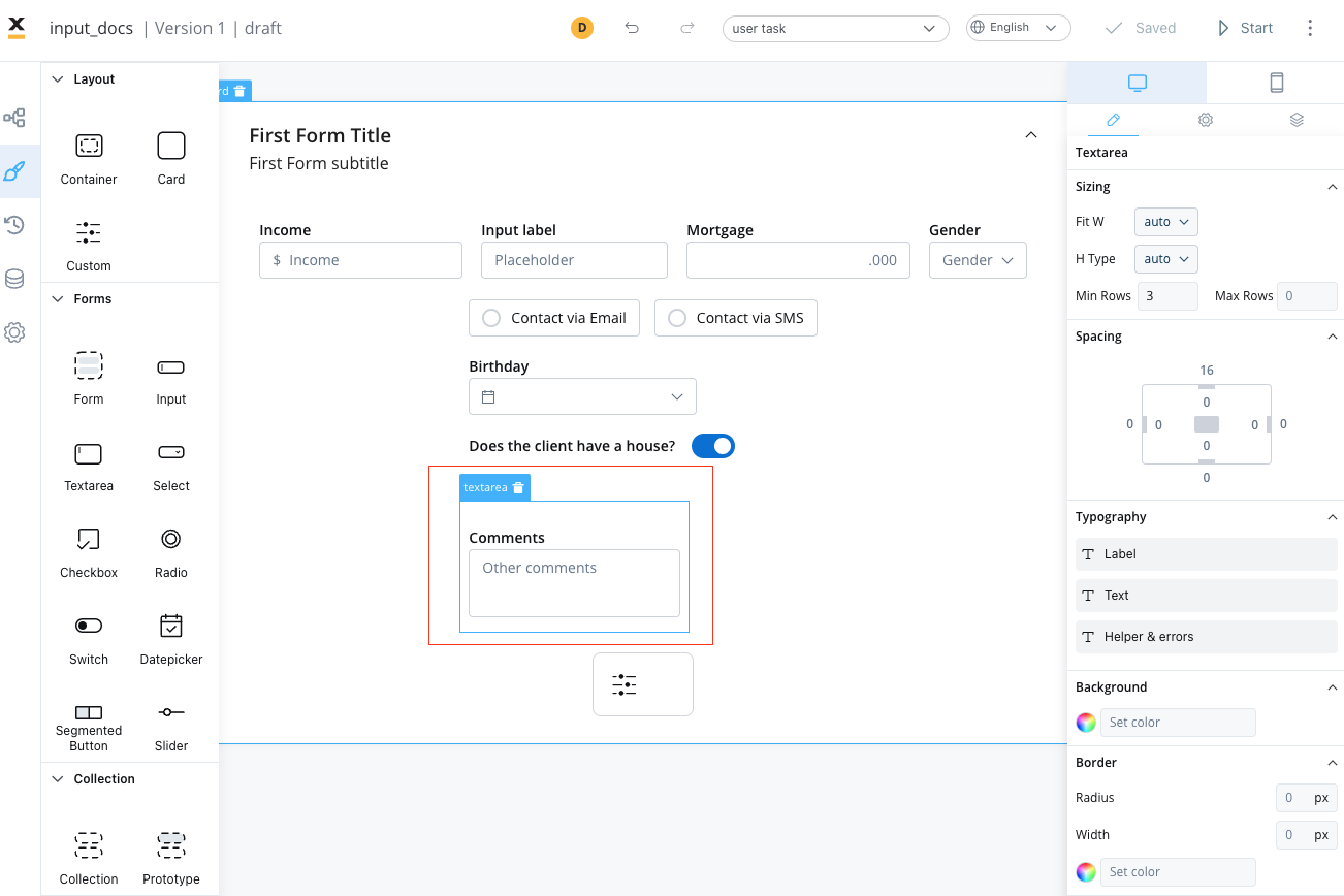
It is an important tool for creating intuitive and effective conversational interfaces that can collect and process large amounts of user input.
## Configuring the text area element
### Text area settings
The text area offers the following configuration options:
* [**General**](#general)
* [**Properties**](#properties)
* [**Datasource**](#datasource)
* [**Validators**](#validators)
* [**Expressions**](#expressions)
* [**UI actions**](#ui-actions)
* [**Text area styling**](#text-area-styling)
#### General
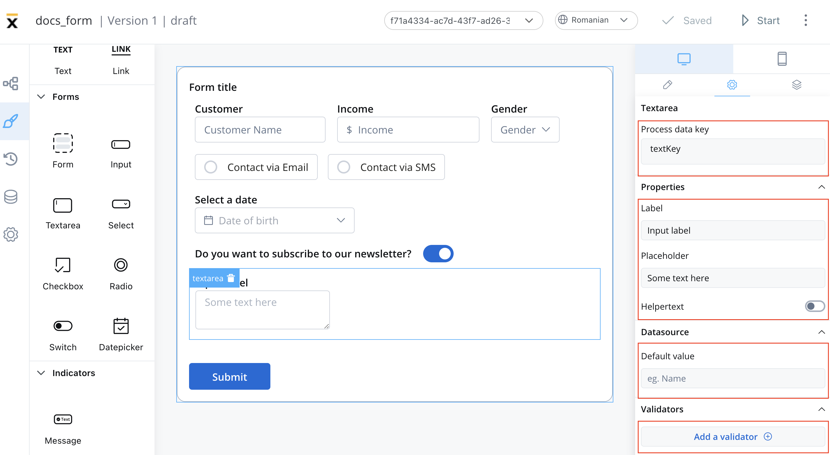
* **Process data key** - creates the binding between form element and process data, so it can be later used in [decisions](../../../node/exclusive-gateway-node), [business rules](../../../actions/business-rule-action/business-rule-action) or [integrations](../../../node/message-send-received-task-node#from-integration)
#### Properties
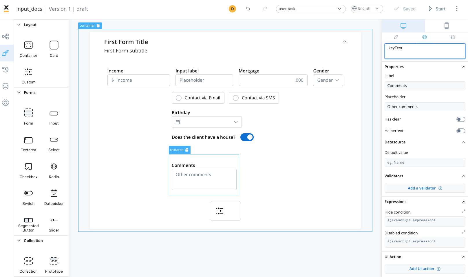
* **Label** - the label of the text area
* **Placeholder** - the placeholder text that appears in the text area
* **Has clear** - content clear property
* **Helpertext** - additional information about the text area field (can be hidden inside an infopoint)
#### Datasource
The default value for the element can be configured here, this will autofill the text field when you will run the process.
#### Validators
There are multiple validators can be added to a text area element (more details [here](../../validators)).
#### Expressions
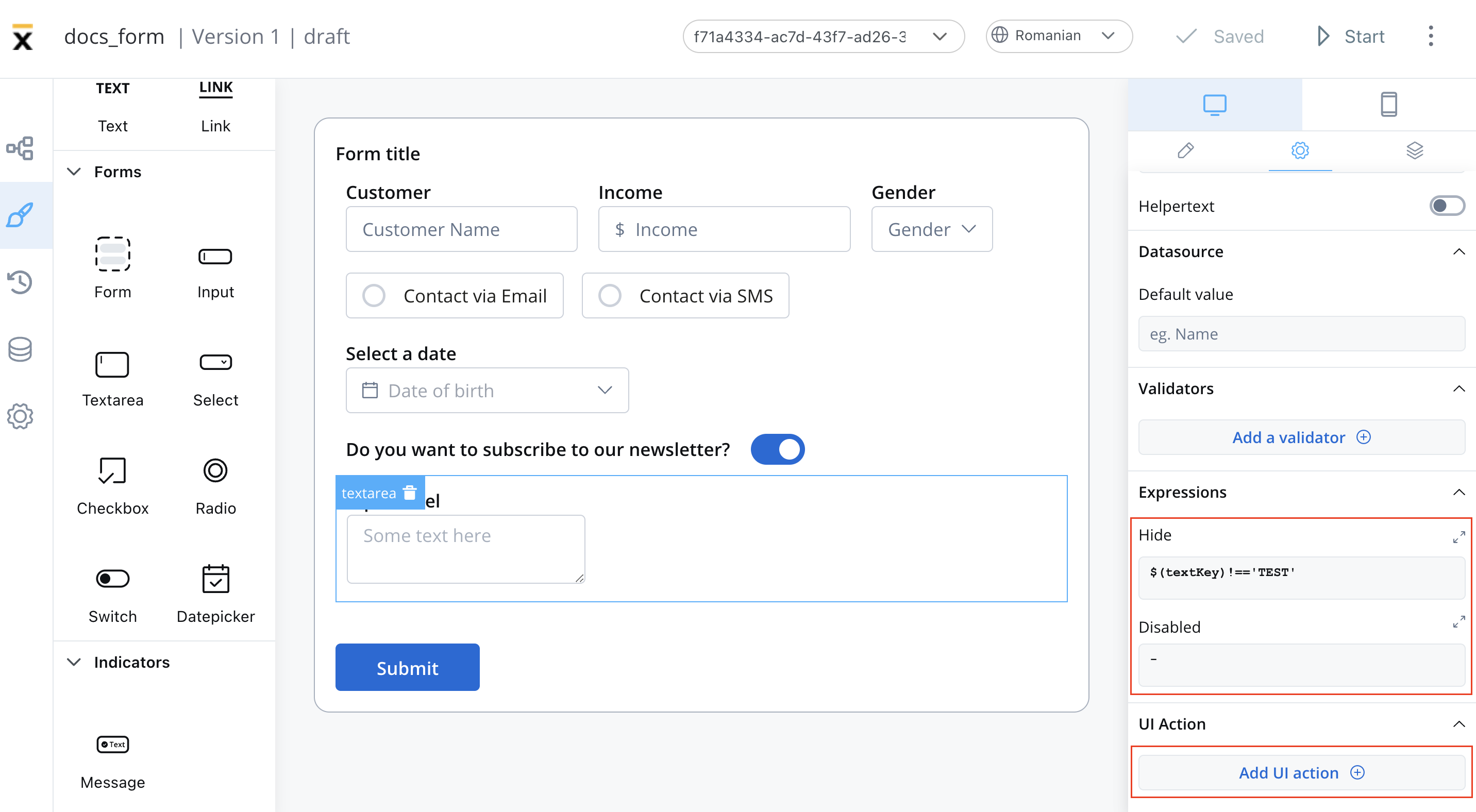
The text area's behavior can be defined using JavaScript expressions for hiding or disabling the element. The following properties can be configured for expressions:
* **Hide** - JavaScript expression used to hide the text area when it returns a truthy value
* **Disabled** - JavaScript expression used to disable the text area when it returns a truthy value
It's important to make sure that disabled fields have the same expression configured under the path expressions → hide.
#### UI actions
UI actions can be added to the text area field to define its behavior and interactions.
* **Event** - possible value: `CHANGE`
* **Action Type** - select the action type
For more details on how to configure a UI action, click [**here**](../../ui-actions).
### Text area styling
The ability to style the text area element using CSS properties is relevant because it allows you to customize the appearance of the text area to match the overall design of the website or application.
## Related topics
- [FlowX.AI 5.6.0 Release Notes](/release-notes/v5.x/v5.6.0-march-2026/v5.6.0-march-2026.md)
- [FlowX.AI 5.1.2 Release Notes (LTS)](/release-notes/v5.x/v5.1.x-lts/v5.1.2-december-2025.md)
- [FlowX.AI 5.1.0 Release Notes](/release-notes/v5.x/v5.1.x-lts/v5.1.0-october-2025/v5.1.0-october-2025.md)
- [FlowX.AI 5.9.0 Release Notes](/release-notes/v5.x/v5.9.0-june-2026/v5.9.0-june-2026.md)
- [FlowX.AI 4.7.10 Release Notes](/release-notes/v4.x/v4.7.x-lts/v4.7.10-november-2025/v4.7.10-november-2025.md)