> ## Documentation Index
> Fetch the complete documentation index at: https://docs.flowx.ai/llms.txt
> Use this file to discover all available pages before exploring further.
# Slider
> It allows users to pick only one option from a group of options, and you can choose to have between 2 and 5 options in the group. The segmented button is easy to use, and can help make your application easier for people to use.
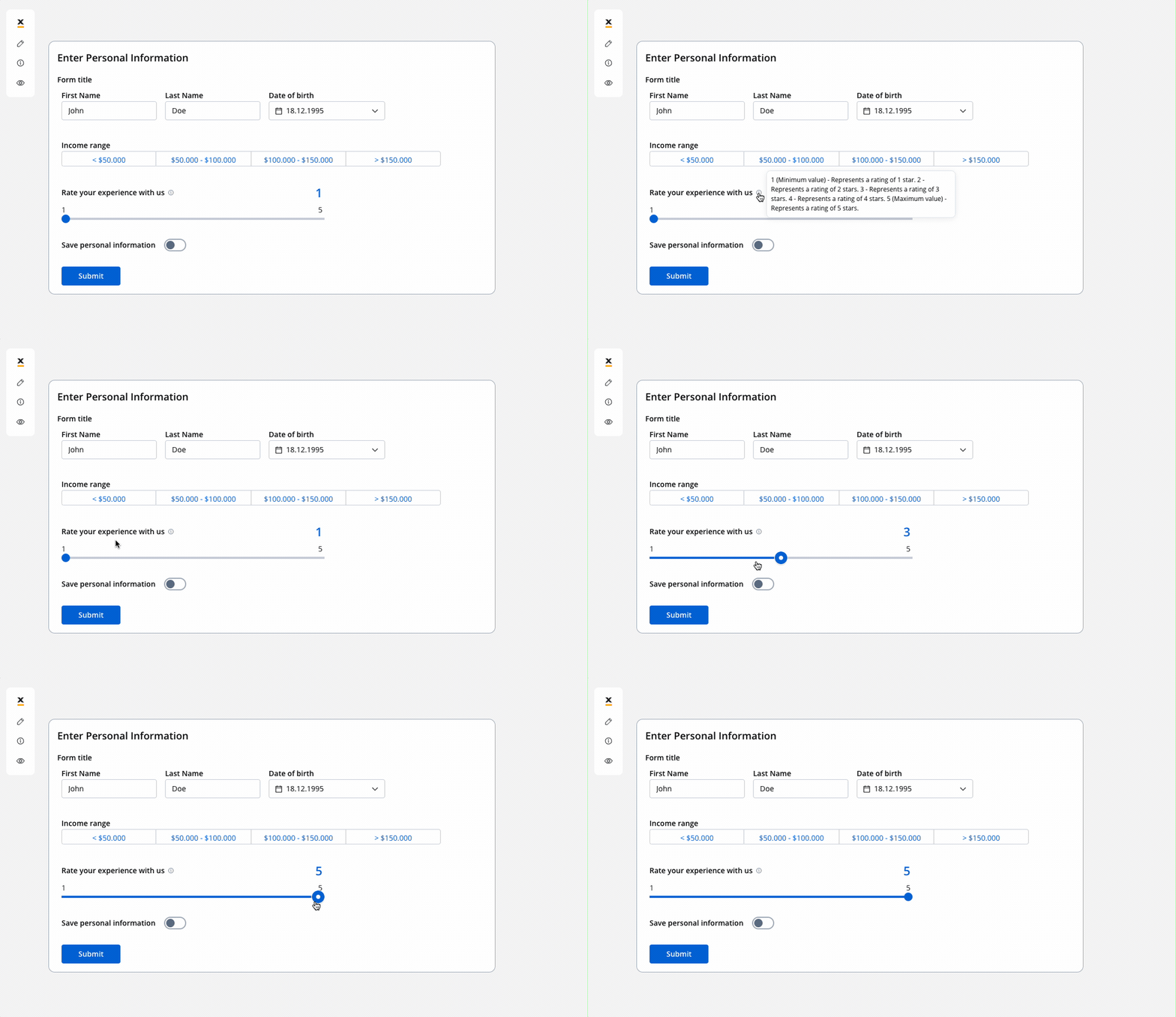
## Configuring the slider element
### Slider settings
The available configuration options for this form element are:
* [**General**](#general)
* [**Properties**](#properties)
* [**Datasource**](#datasource)
* [**Validators**](#validators)
* [**Expressions**](#expressions)
* [**UI actions**](#ui-actions)
* [**Slider styling**](#slider-styling)
#### General
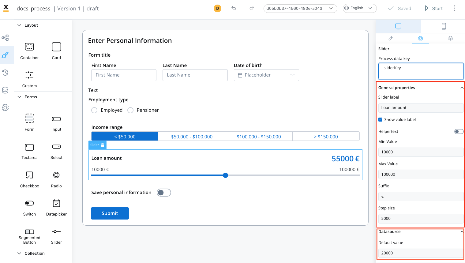
* **Process data key** - creates the binding between form element and process data so it can be later used in [decisions](../../../node/exclusive-gateway-node), [business rules](../../../actions/business-rule-action/business-rule-action) or [integrations](../../../node/message-send-received-task-node#from-integration)
#### Properties
* **Label** - the label of the slider
* **Show value label** - a toggle option that determines whether the current selected value of the slider is displayed as a label alongside the slider handle
* **Helpertext** - an optional field that provides additional information or guidance related to the usage or function of the slider, it can be hidden within an infopoint, which users can expand or access for further detail
* **Min Value** - the minimum value or starting point of the slider's range, it defines the lowest selectable value on the slider
* **Max Value** - the maximum value or end point of the slider's range, it sets the highest selectable value on the slider
* **Suffix** - an optional text or symbol that can be added after the displayed value on the slider handle or value label, it is commonly used to provide context or units of measurement
* **Step size** - the increment or granularity by which the slider value changes when moved, it defines the specific intervals or steps at which the slider can be adjusted, allowing users to make more precise or discrete value selections
#### Datasource
* **Default Value** - the default value of the slider (static value - integer) the initial value set on the slider when it is first displayed or loaded, it represents a static value (integer), that serves as the starting point or pre-selected value for the slider, users can choose to keep the default value or adjust it as desired
#### Validators
The following validators can be added to a slider: `required` and `custom` (more details [here](../../validators)).
#### UI actions
UI actions can be added to the slider element to define its behavior and interactions.
* **Event** - possible value: CHANGE
* **Action Type** - select the action type, ❗️ for more details on how to configure a UI action, click [**here**](../../ui-actions)
### Multiple sliders
You can also use multiple sliders UI elements that are interdependent, as you can see in the following example:
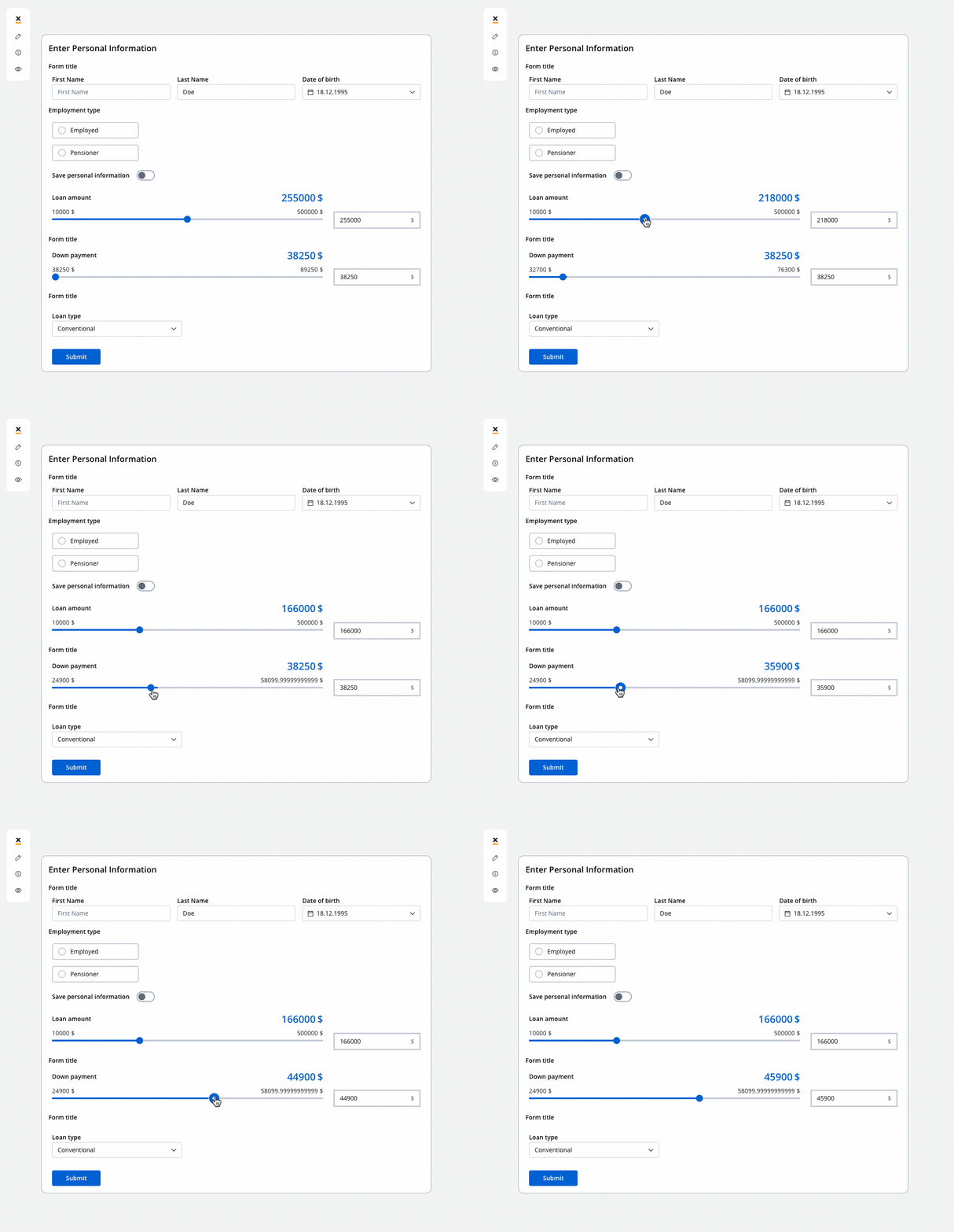
You can improve the configuration of the slider using computed values as in the example above. These values provide a more flexible and powerful approach for handling complex use cases. You can find an example by referring to the following documentation:
[**Dynamic & computed values**](../../dynamic-and-computed-values#computed-values)
### Slider styling
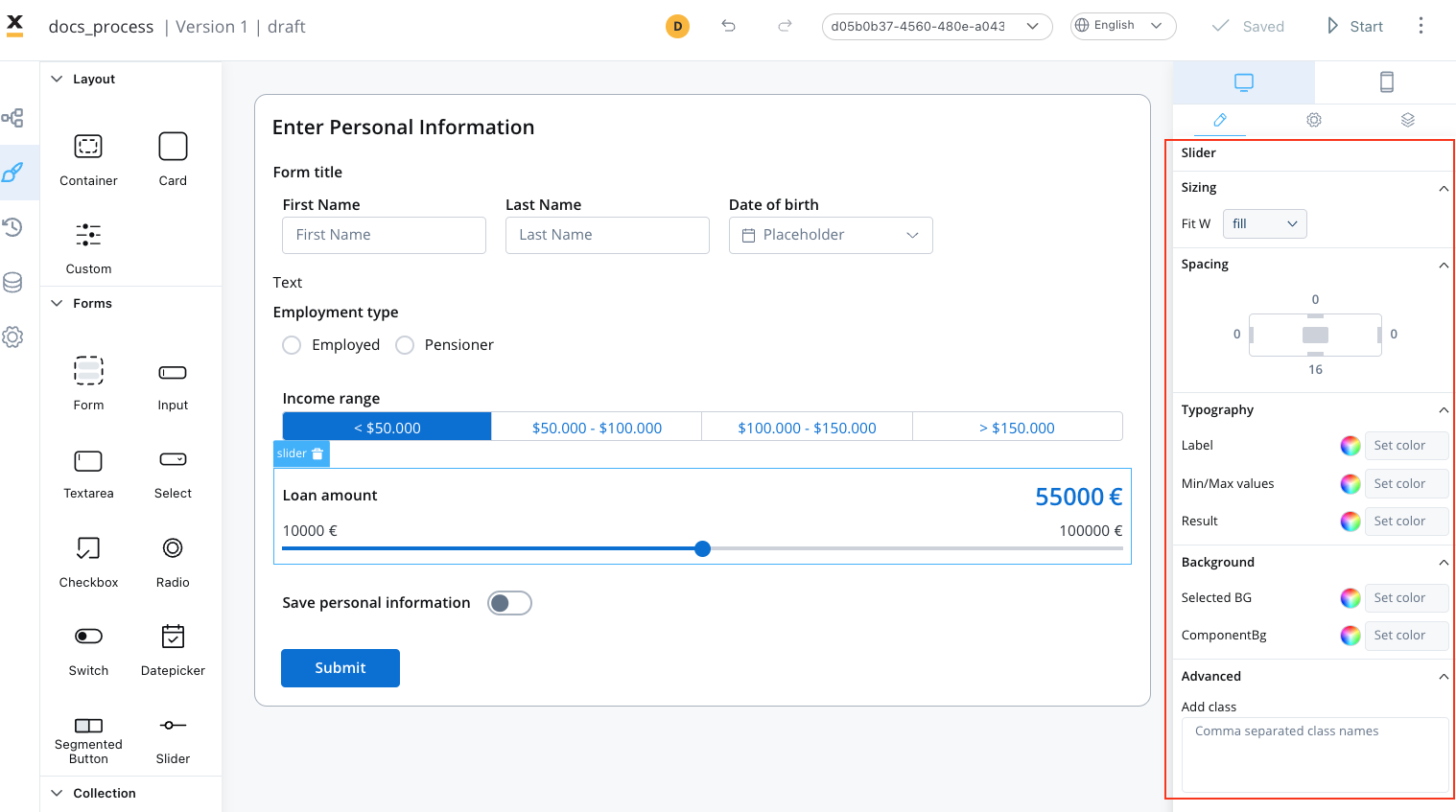
To create a slider with specific styling, sizing, typography, and color settings, you can use the following configuration:
* [Sizing](#sizing)
* [Typography](#typography)
* [Background](#background)
#### Sizing
* set the width of the button - fill/fixed/auto
#### Typography
Choose an appropriate font family, size, and weight for the button label text.
* **Label Color** - set the color of the button label text
* **Min/Max values** - set the color of
* **Result** - set the color of the
#### Background
* **Selected BG** - set the background color of the button.
* **ComponentBg** - set the background color of the button.
For more valid CSS properties, click [**here**](../../#styling).
## Related topics
- [FlowX.AI 5.1.6 Release Notes (LTS)](/release-notes/v5.x/v5.1.x-lts/v5.1.6-march-2026.md)
- [FlowX.AI 4.6.1 Release Notes](/release-notes/v4.x/v4.6.x/v4.6.1-february-2025/v4.6.1-february-2025.md)
- [FlowX.AI 5.9.0 Release Notes](/release-notes/v5.x/v5.9.0-june-2026/v5.9.0-june-2026.md)
- [FlowX.AI 5.0.0 Release Notes](/release-notes/v5.x/v5.0.0-july-2025/v5.0.0-july-2025.md)
- [FlowX.AI 5.1.0 Release Notes](/release-notes/v5.x/v5.1.x-lts/v5.1.0-october-2025/v5.1.0-october-2025.md)