> ## Documentation Index
> Fetch the complete documentation index at: https://docs.flowx.ai/llms.txt
> Use this file to discover all available pages before exploring further.
# Segmented button
> It allows users to pick only one option from a group of options, and you can choose to have between 2 and 5 options in the group. The segmented button is easy to use, and can help make your application easier for people to use.
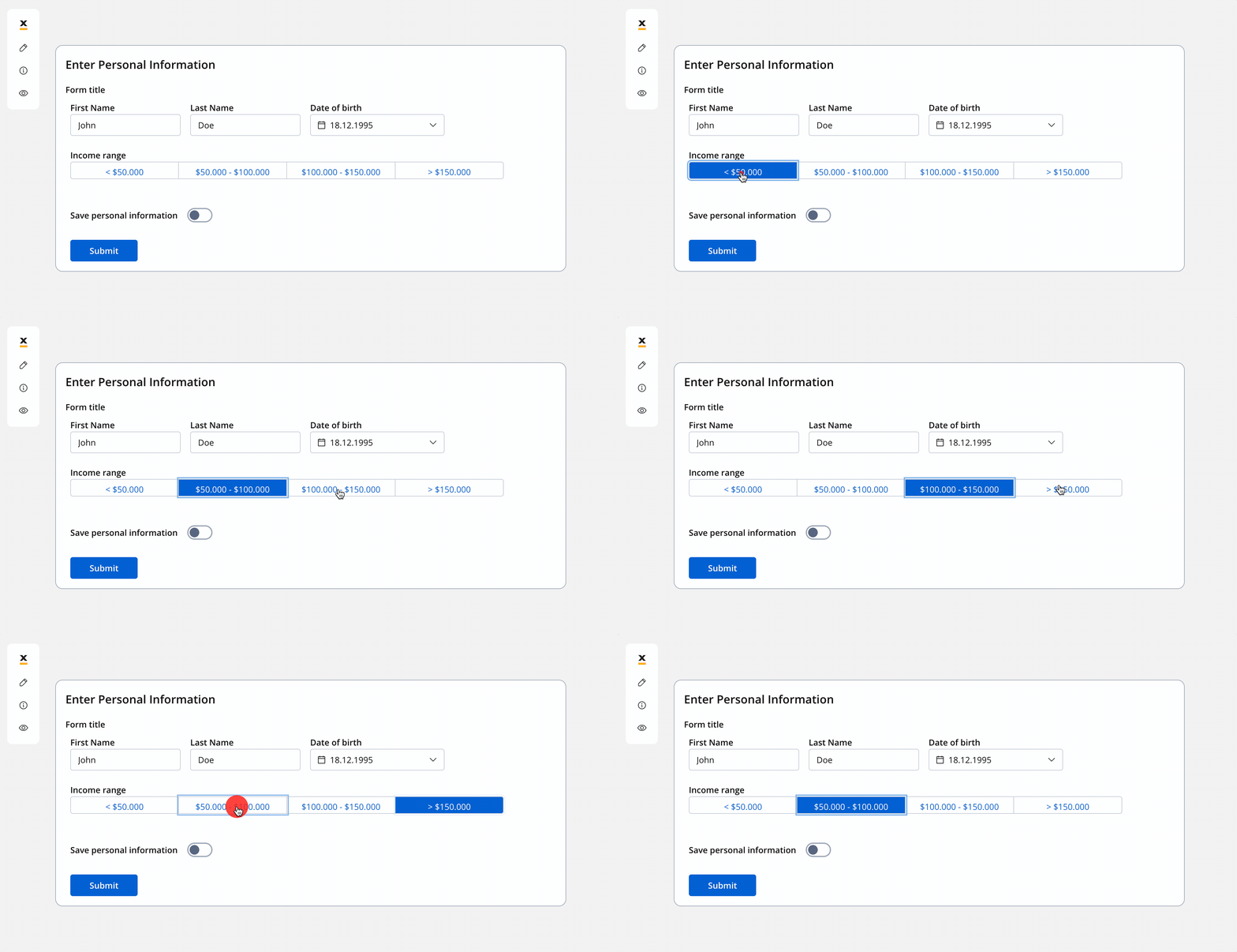
## Configuring the segmented button
### Segmented button settings
The available configuration options for this form element are:
* [**General**](#general)
* [**Properties**](#properties)
* [**Datasource**](#datasource)
* [**Validators**](#validators)
* [**Expressions**](#expressions)
* [**UI actions**](#ui-actions)
* [**Segmented button styling**](#segmented-button-styling)
#### General
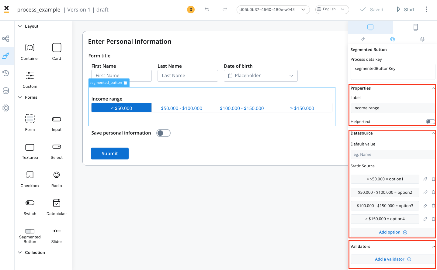
* **Process data key** - creates the binding between form element and process data so it can be later used in [decisions](../../../node/exclusive-gateway-node), [business rules](../../../actions/business-rule-action/business-rule-action) or [integrations](../../../node/message-send-received-task-node#from-integration)
#### Properties
* **Label** - the label of the segmented button
* **Helpertext** - additional information about the segmented button (can be hidden inside an infopoint)
#### Datasource
* **Default Value** - the default value of the segmented button (it can be selected from one of the static source values)
* **Source Type** - it is by default Static
* **Add option** - value/label pairs can be defined here
#### Validators
The following validators can be added to a segmented button: `required` and `custom` (more details [here](../../validators)).
#### UI actions
UI actions can be added to the segmented button element to define its behavior and interactions.
* **Event** - possible value: CHANGE
* **Action Type** - select the action type
For more details on how to configure a UI action, click [**here**](../../ui-actions).
### Segmented button styling
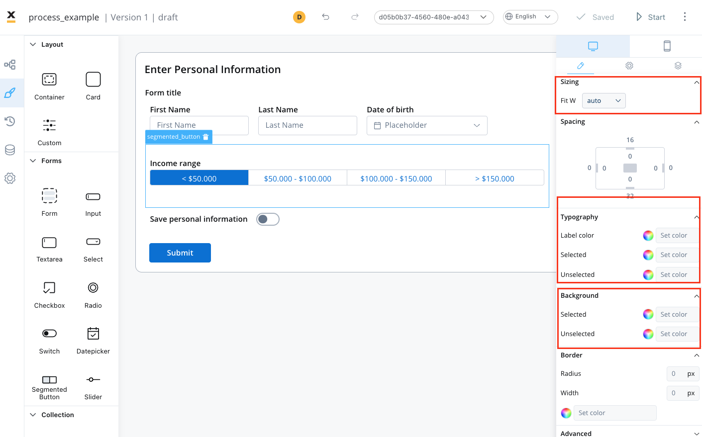
To create a segmented button with specific styling, sizing, typography, and color settings, you can use the following configuration:
* [Sizing](#sizing)
* [Typography](#typography)
* [Background](#background)
#### Sizing
* set the width of the button - fill/fixed/auto
#### Typography
Choose an appropriate font family, size, and weight for the button label text.
* **Label Color** - set the color of the button label text
* **Selected State** - set the color of the label text when the button is selected
* **Unselected State** - set the color of the label text when the button is not selected
#### Background
* **Selected state** - set the background color of the button
* **Unselected state** - set the background color of the button
For more valid CSS properties, click [**here**](../../#styling).
## Related topics
- [FlowX.AI 5.1.1 Release Notes (LTS)](/release-notes/v5.x/v5.1.x-lts/v5.1.1-november-2025.md)
- [FlowX.AI 5.9.0 Release Notes](/release-notes/v5.x/v5.9.0-june-2026/v5.9.0-june-2026.md)
- [FlowX.AI 5.2.0 Release Notes](/release-notes/v5.x/v5.2.0-november-2025/v5.2.0-november-2025.md)
- [FlowX.AI 5.8.0 Release Notes](/release-notes/v5.x/v5.8.0-may-2026/v5.8.0-may-2026.md)
- [FlowX.AI 5.1.6 Release Notes (LTS)](/release-notes/v5.x/v5.1.x-lts/v5.1.6-march-2026.md)