> ## Documentation Index
> Fetch the complete documentation index at: https://docs.flowx.ai/llms.txt
> Use this file to discover all available pages before exploring further.
# File preview
> The File Preview UI element is a user interface component that enables users to preview the contents of files quickly and easily without fully opening them. It can save time and enhance productivity, providing a glimpse of what's inside a file without having to launch it entirely.
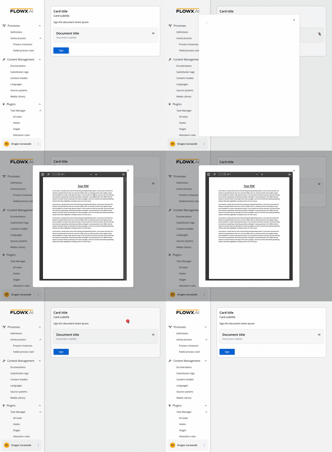
File preview UI elements offer various benefits such as conveying information, improving the aesthetic appeal of an interface, providing visual cues and feedback or presenting complex data or concepts in a more accessible way.
## Configuring a File preview element
A File Preview element can be configured for both mobile and web applications.
### File preview properties (web)
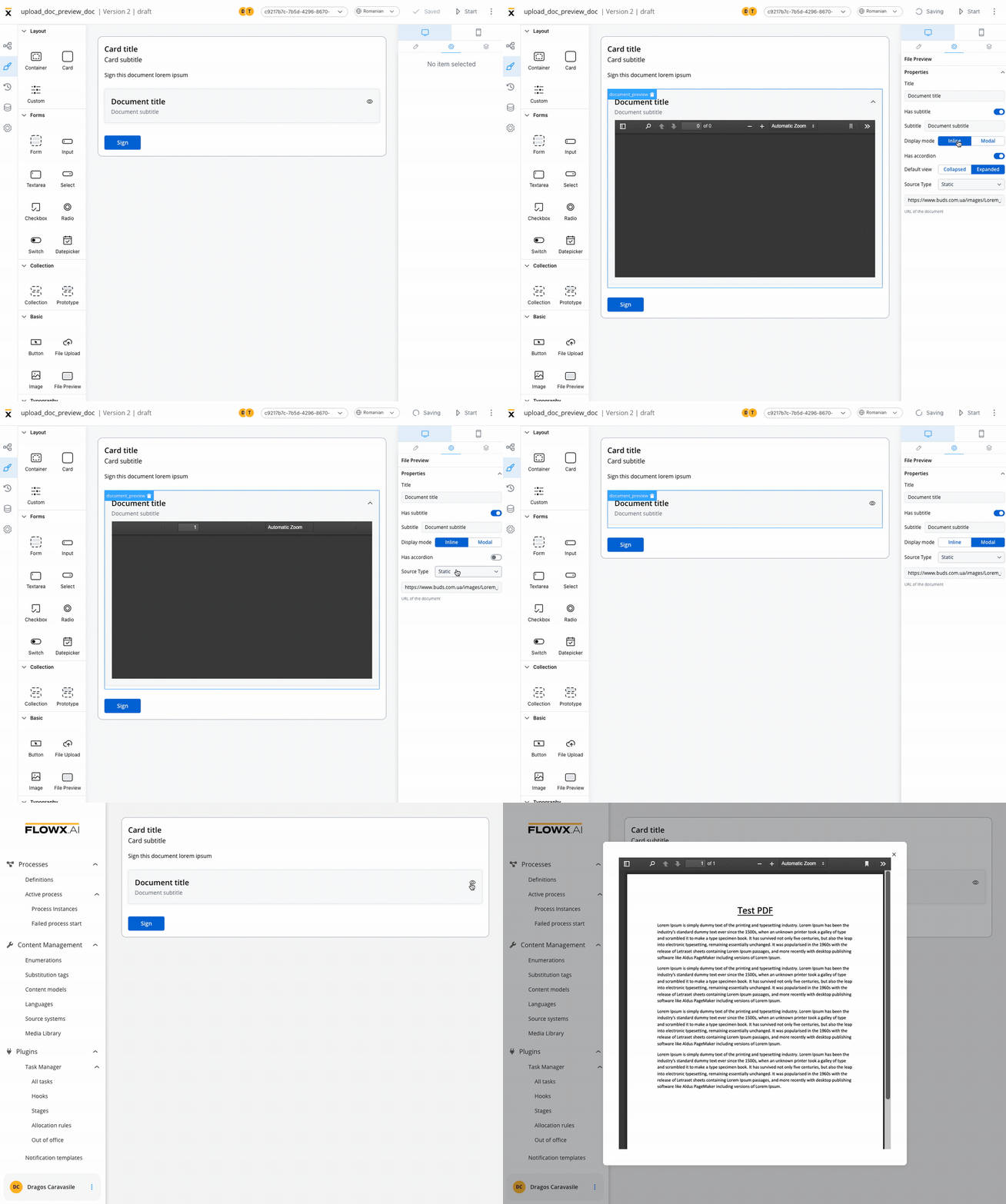
The File Preview element settings consist of the following properties:
* **Title** - the title of the element (if it is downloaded or shared - the file name should be the title used in preview component)
* **Has subtitle** - the subtitle of the element
* **Display mode** - depending on the selected display method the following properties are available:
* **Inline** → **Has accordion**:
* `false` - display preview inline, without expand/collapse option
* `true` - Default View: Collapsed - display preview inline, with expand/collapse option, by default collapsed
* `true` - Default View: Expanded - display preview inline, with expand/collapse option, by default expanded
* **Modal** → view icon is enabled
* **Source Type** -
* **Process Data** - process key where the document is found (creates the binding between the element and process data)
* **Static** - URL of the document
It's worth noting that the inline modal view can raise accessibility issues if the file preview's height exceeds the screen height.
### File preview properties (mobile)
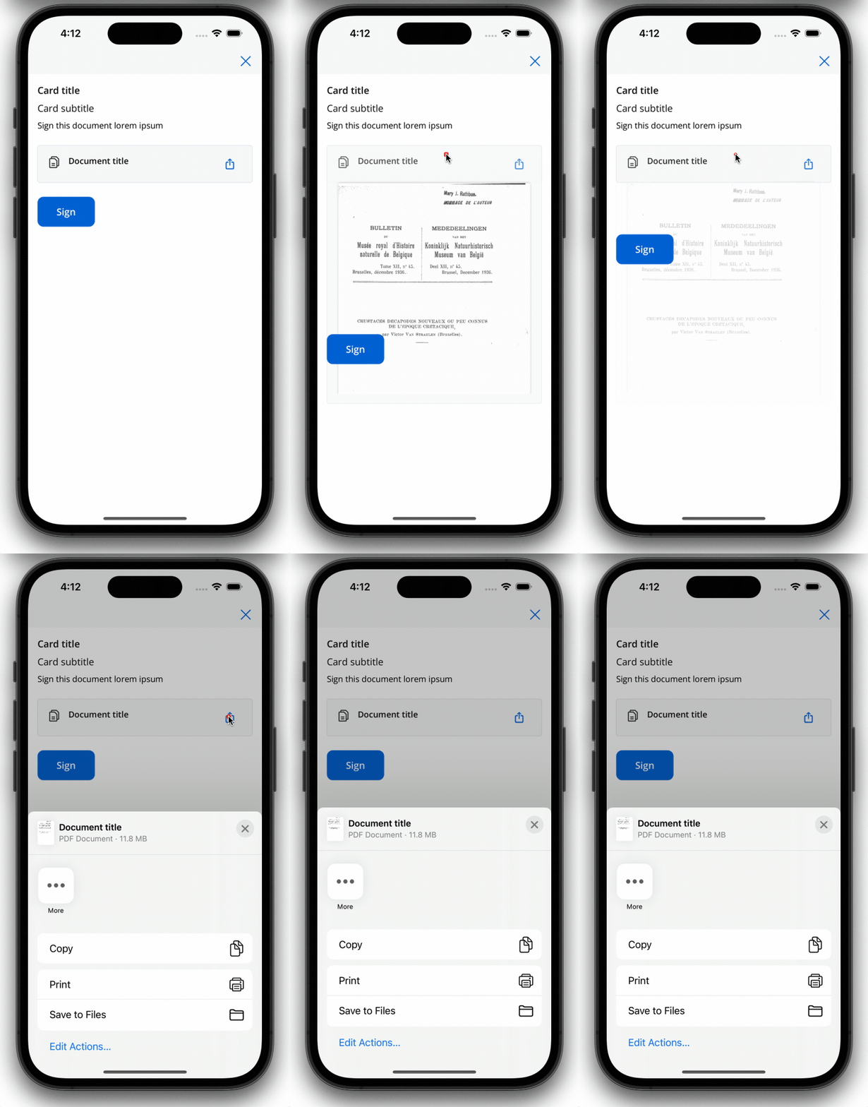
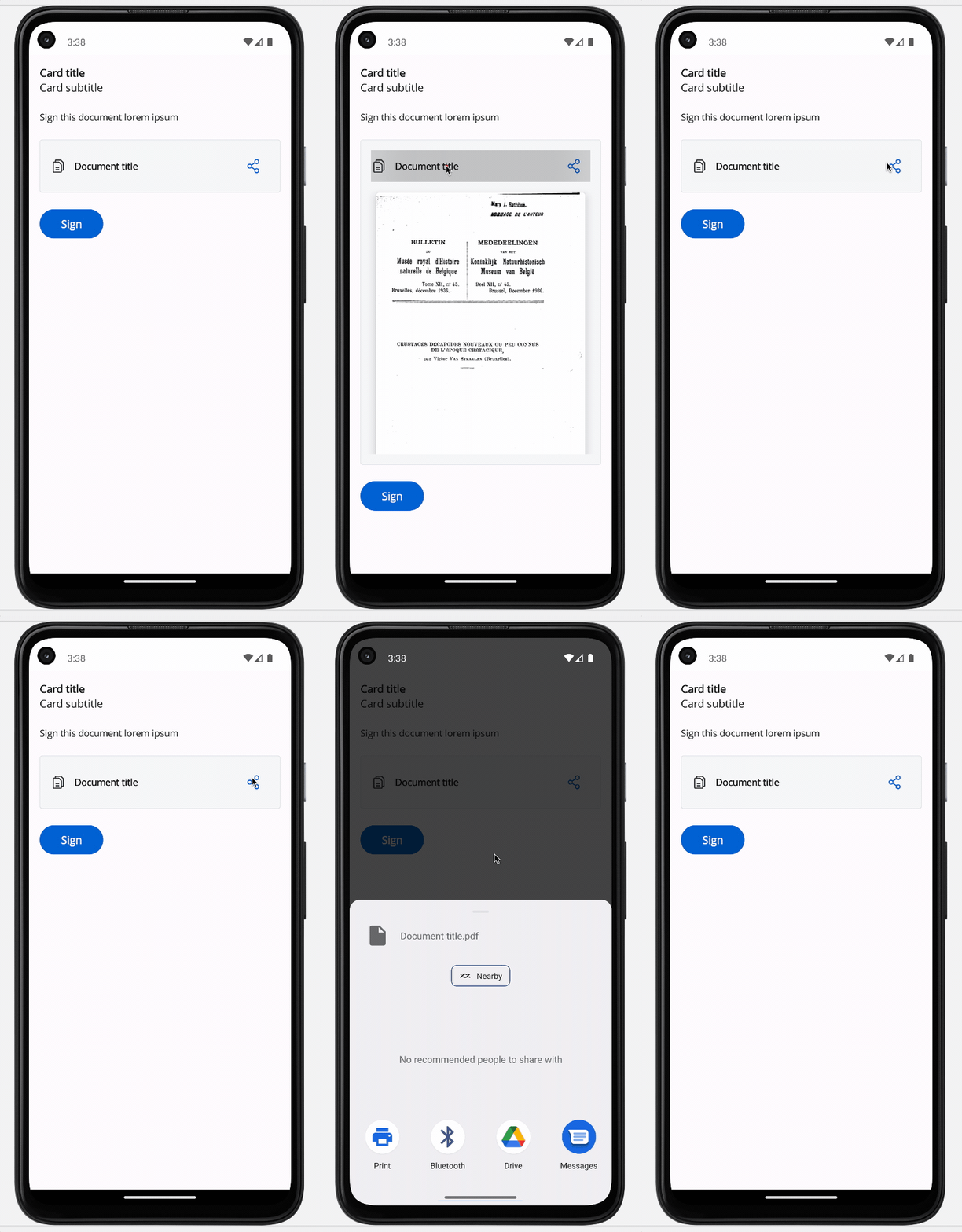
Both iOS and Android devices support the share button.
#### iOS
#### Android
### File preview styling
The File Preview styling property enables you to customize the appearance of the element by adding valid CSS properties, for more details, click [here](../../ui-designer/ui-designer#styling).
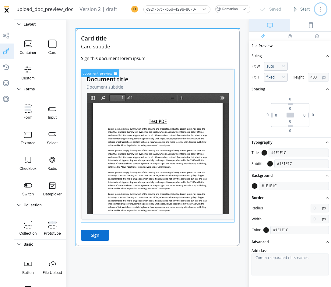
When drag and drop a File Preview element in UI Designer, it comes with the following default styling properties:
#### Sizing
* **Fit W** - auto
* **Fit H** - fixed / Height - 400 px
## File Preview example
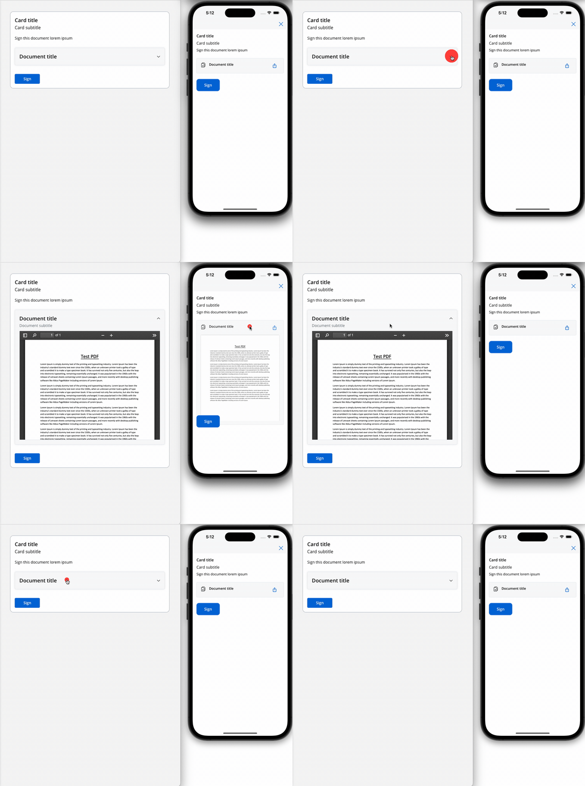
Below is an example of a File Preview UI element with the following properties:
* **Display mode** - Inline
* **Has accordion** - True
* **Default view** - Expanded
* **Source Type** - Static
## Related topics
- [FlowX.AI 5.9.1 Release Notes (LTS)](/release-notes/v5.x/v5.9.1-june-2026/v5.9.1-june-2026.md)
- [FlowX.AI 5.1.6 Release Notes (LTS)](/release-notes/v5.x/v5.1.x-lts/v5.1.6-march-2026.md)
- [FlowX.AI 4.6.1 Release Notes](/release-notes/v4.x/v4.6.x/v4.6.1-february-2025/v4.6.1-february-2025.md)
- [FlowX.AI 5.1.1 Release Notes (LTS)](/release-notes/v5.x/v5.1.x-lts/v5.1.1-november-2025.md)
- [FlowX.AI 5.1.10 Release Notes (LTS)](/release-notes/v5.x/v5.1.x-lts/v5.1.10-june-2026.md)